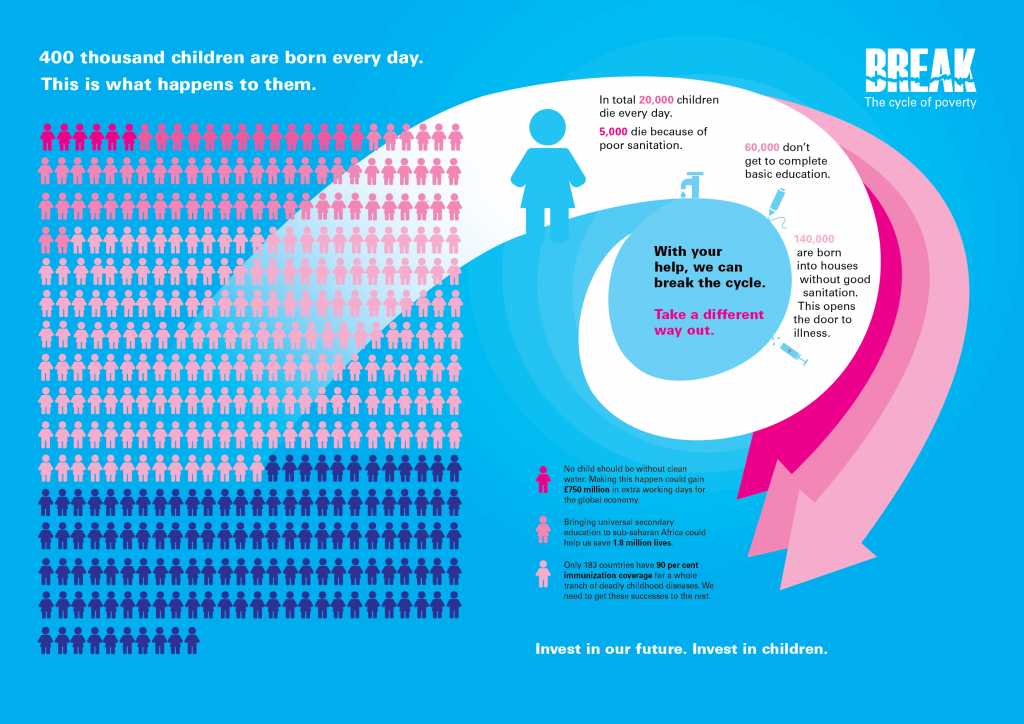
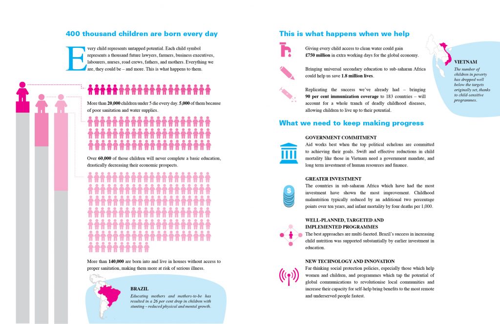
One of my university projects this year was a ‘personal’ project. I wanted to work on my infographics experience, and put a call out on Twitter for charities that might be willing to have me do dubious things to their data.
The lovely Unicef responded, and while this isn’t strictly official so I can’t use their logos, these were both designed for their report into child poverty and child mortality.
A3 poster
Report spread
What do you think?
The following two tabs change content below.


Corinne Pritchard
Information Designer at Simply Understand
I believe design and designers can and should make the world a better place. I love designing things that help people understand complex ideas.
Latest posts by Corinne Pritchard (see all)
- Linked — 5 September 2016
- Designing a fashion website — 26 October 2014
- Service design conference — 9 October 2014

