Infographics can be beautiful, informative, fascinating, genuinely entertaining and educational. On a personal level, I’m a big fan. My own overwhelming need to understand things to the best of my ability has been nicely enhanced by this recent trend.
Infographics come in a few flavours (chocolate, strawberry and banana). There are straight-up graph types, area types, and in the grand tradition of design everywhere, misc. other.
My concern about infographics in general is that how understandable and accessible they are (mainly) is detrimentally affected by two things:
- How much the viewer knows about reading graphs
- The brain’s capabilities for comparing sizes and areas
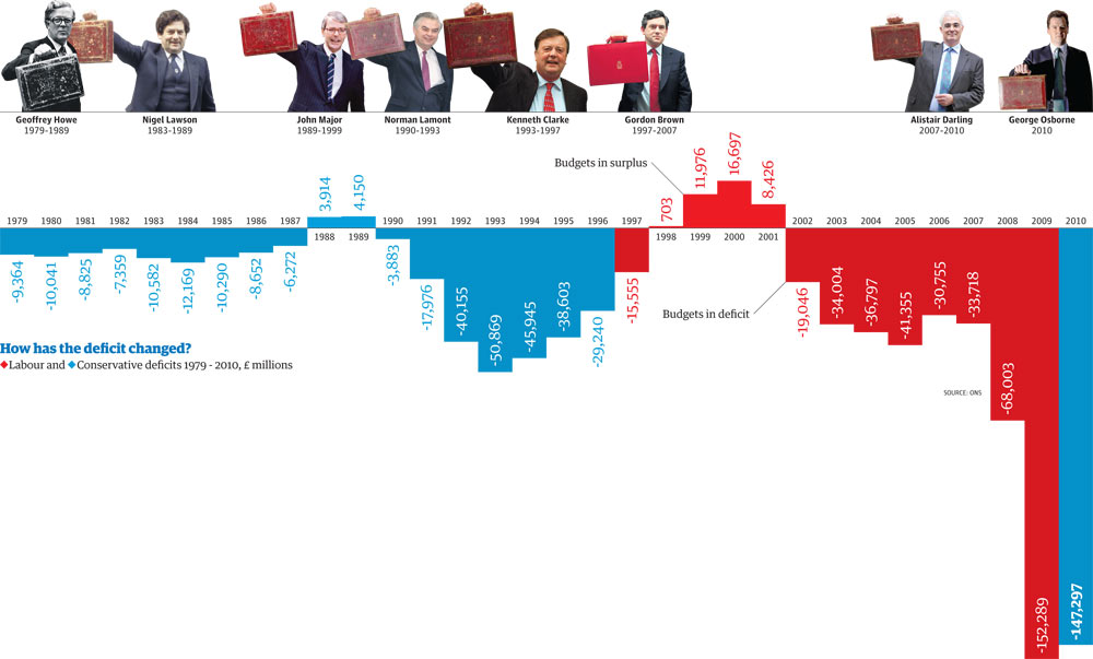
Most infographics are graphs. Most of them are, in fact, bar graphs (see below). Sometimes they’re pretty well disguised. You might get some blocks arranged in a row or a square. You might be given ten little pictograms of a man. Some are more blatant than others.
But what if you can’t read a bar chart? As far as I can see, there haven’t been any real studies done on graph literacy — and it’s impossible to Google due to all those graphs of literacy around — but if you equate it with maths literacy, something like 22% — nearly a quarter — of 16–19 year olds left school, last year, functionally innumerate in anything but the most basic arithmetic.
You’ll have to do your own extrapolation to apply that to the rest of the population, and no doubt for most people, their grasp of maths (and graphs) improves with age, but even still — if that many people simply aren’t at the mathematical stage that they can read graphs, then infographics potentially have only limited usefulness.
Take for example how infographics are used in newspapers. Could these numeracy requirements be one of the reasons tabloid newspapers haven’t taken them up wholesale, while broadsheets are positively dizzy with excitement about them?
Now there are several infographic models that are extremely popular right now — and one of them is this idea of a set of squares, or circles, or whatever, with their size representing a different value, right? Us humans are masters (and mistresses) of pattern recognition. We can group objects by shape, colour, angle, proximity… but can we really compare size and areas effectively?
Take circles, for example. They’re easy to group into pretty patterns, but there’s a fundamental problem with interpreting circular infographics (among others). Now, designers have been told that they should use the area of the circle — which is generally convenient for them, as you end up with smaller circles which are easier to fit on the page, however, no-one gets to tell the viewer whether they should be looking at the diameter of the circle or the area.
Why is that important? Because as a rule, the human brain is quite bad at working out how to compare circles — if we’re comparing areas, generally we see them as representing a smaller value than they do, and if we’re comparing diameter, we generally think they represent larger values than they actually do. But hey, there’s no guarantee which one your viewer is judging, anyway!
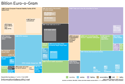
How about squares and rectangles? Take a look at the Billion Euro-o-Gram:
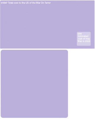
Comparing squares is probably fine, because whatever measurement you use, what you see will be proportional. But what happens when you use rectangles? Could one edge being longer than the other affect your perception of it, make it seem bigger than a square with the same area? Here’s the big purple rectangle as it’s pictured, and as a square. I’m not sure I’d know they represented the same figure, if they were presented side by side, but that’s what this particular infographic asks us to do.
And if two similar-sized squares are far away from each other, or surrounded by objects of different sizes, wouldn’t the brain find it harder to tell which is bigger? In the bottom-middle there’s a load of figures around the €200 billion mark, but they’re all portrayed in different ways, making them difficult to compare.
€38 billion (in purple, right-middle) looks much smaller than €40 billion (light blue, bottom-middle) because of colour contrast and because it’s surrounded by values that match it’s height but not width, squeezing it.
The trouble for me is, I quite like infographics. I like designing them. I’m even guilty of perpetuating a fair few of the complaints I’m levelling at these examples. But I can’t help but recognise that as pretty as they are, they have limited appeal.
And if we want more than the usual suspects to be able to make head or tail of them, we need to make sure the infographics we create are much more accessible.
Corinne Pritchard
Latest posts by Corinne Pritchard (see all)
- Linked — 5 September 2016
- Designing a fashion website — 26 October 2014
- Service design conference — 9 October 2014


Do I see the beginning of a dissertation thesis here?
Nope, that’s going to be on something else :)