This is the second in a series of posts about the projects I“ve been doing as part of my Masters in Information Design at the University of Reading.
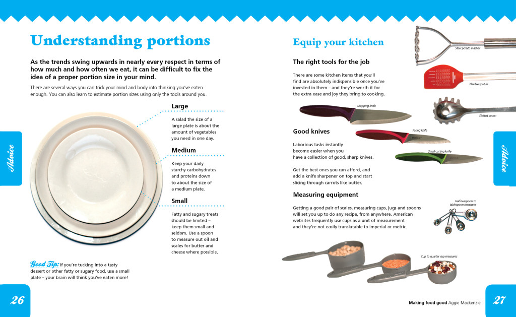
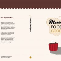
Book design was the second project we had and perhaps the one I most dreaded. Only one term in and feeling my lack of design experience very keenly, the thought of designing a whole book was intimidating.
Heck, it turned out I didn’t even know what books really looked like. It had entirely escaped my notice, for instance, that there are usually quite a few pages before you get to the first proper page. I had no idea what perfect-binding was. Frankly, at this point I hadn’t even worked out the basics of InDesign. In short, I was pretty sunk.
My early attempts were pretty pitiful. So much so that I’m too embarrassed to show them to you! To give the designers among you a clue, I’ll just throw the words ‘Minion Pro’, ‘1 cm margins’ and ‘jpegs’ out there. Ahem.
However, while I initially struggled with the design and I’m aware of how lucky I was to have two years to work on the final version (boy did it need the time), this was also the main project we did some proper usability work on.
The usability project
Now, as you’ll know, usability is a bit of a pet topic for me. It refers to the principle that before you make any kind of finished product that’s meant to do a job, or interact with people in a useful way, you’re supposed to test it. And iron out the bugs. And test it again. And iron out the bugs. And so on, and so on.
It involves identifying your audience (which frankly you should have already done when you came up with the idea), and then letting them lose on your system — whether that’s a whole website, a web tool, a humble diagram, and yes, even books.
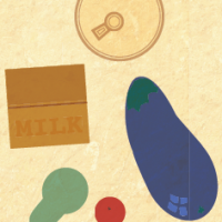
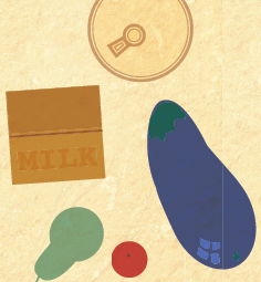
For my ‘book’ I’d had the idea that I wanted to illustrate it rather than use photographs (more fool me). So for my usability testing, I decided to investigate the recognisability of illustrations vs. photos. I drew some rather suspect vector images of various foodstuffs, printed them anda corresponding set of photographs out, and ventured out into Hyde Park one blustery summer day.
In what wasn’t ever going to be the most robust test, I sat people down one after the other with a stopwatch and showed them either an image or a photograph. When they recognised it, I stopped the stopwatch. Sometimes I had to stop the stopwatch because the papers blew away. Nevermind.
I found that illustrations had a much lower recognition rate than photographs. And while this could merely have been testimony to my poor drawing skills, it was enough to make me ditch the drawings — and hopefully make a better book at the end of it all!
The moral of the story is: designers are often wrong. So make sure you test their ideas. Please.
Corinne Pritchard
Latest posts by Corinne Pritchard (see all)
- Linked — 5 September 2016
- Designing a fashion website — 26 October 2014
- Service design conference — 9 October 2014
