Part of what I am (or at least, will be) learning in my Masters in Information Design at the University of Reading is ‘wayfinding’. Yes, signs. Surely, you might ask, that’s something that town planners, architects, etc take care of?
Well, they can if they want, but if you want the job done properly, you might think about getting an information or wayfinding designer in for that!
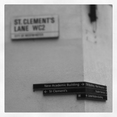
I saw these at the London School of Economics, and thought they were amazing — the way they work with the walls and street lines and guide your eye and feet in the right direction is very cool.
If I were to change it, I might add the function of those buildings to the sign, or replace the building names with the functions. It took me a fair bit of googling to find out the Lionel Robbins building was the library.
Inside the library was another matter, though. Got told off for standing on the wrong side of the queue barrier, when all the signs were facing towards me… I grumbled a bit and turned the signs inward as I went, so hopefully other people won’t have that problem. Sometimes it just takes a small adjustment to fix your information flow.
Anyway, that’s just one of the things Information Design is about.
Corinne Pritchard
Latest posts by Corinne Pritchard (see all)
- Linked — 5 September 2016
- Designing a fashion website — 26 October 2014
- Service design conference — 9 October 2014

We used to do a bit of that in the lighting consultancy — using lighting to aid in wayfinding around city centres, often between transport nodes. It was interesting work, but I always felt a little uncomfortable with it. In hindsight, I think I felt that we were amateurs messing around with somebody else’s urban environment…
Well, you have to take the client into account as well, and user test it thoroughly… otherwise what’s the point? One of last year’s students did an entirely light-based wayfinding system around campus — the mockups looked dead pretty, and useful too!