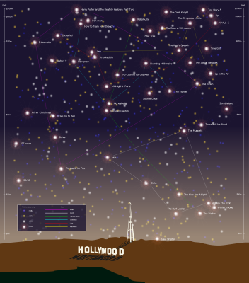
In what is becoming something of a trend, my entry for this month’s Information is Beautiful Awards did not make the shortlist (Matthew Lucas’ design is absolutely stunning). I will have to re-evaluate my non-use of Myriad Pro condensed. One day I might make it! But as the Oscars are swiftly approaching and this visualisation is all about the silver screen, I thought you might want to see it anyway.
The challenge was a little out of my comfort zone — I much prefer illustrating social concerns, things which make a difference to our understanding of the world. We were given a massive spreadsheet of hollywood industry data — profits, losses, genres, etc and asked to tell a visual story. This was mine. Tell me what you think.

The following two tabs change content below.


Corinne Pritchard
Information Designer at Simply Understand
I believe design and designers can and should make the world a better place. I love designing things that help people understand complex ideas.
Latest posts by Corinne Pritchard (see all)
- Linked — 5 September 2016
- Designing a fashion website — 26 October 2014
- Service design conference — 9 October 2014
One thought on “Oscars special: top films visualised”