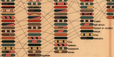
I wanted to make a note of a conversation I keep having with people. Enough that I’m tempted to record my answer with a dictaphone and just play it at them when asked. It goes something like this:
“This new infographics trend is amazing. Such a great way to present information. They’re so engaging and tell great stories.”
Me: “Yes, they’re lovely things, aren’t they?”
Internal monologue: “New? New?! Graphics that show information have been around since the dawn of art. And don’t get me started on them being so engaging and such a great way to present information, because that depends entirely on your audience, their ability to process that information and the level of education required to interpret what you’re showing.”
Anyway, this mini-rant was prompted by the discovery of a website devoted to a 140 year old book almost entirely made of infographics:
Handsome Atlas: Beautiful Data Visualizations from the 19th Century.
via information aesthetics — Data Visualization & Information Design
Corinne Pritchard
Latest posts by Corinne Pritchard (see all)
- Linked — 5 September 2016
- Designing a fashion website — 26 October 2014
- Service design conference — 9 October 2014