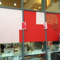
At the beginning of February I started a bit of a career shift. From spare-time designer and full-time web editor, to full-time designer. My new job meant I moved halfway across the country to Lancaster (aka the Frozen North), for a job in Academia — at a design research centre called Imagination. Yes, a designer for designers, aka a glutton for punishment.
Now I’m afraid this does mark a departure away from government consultations. I hope to get back to work like that at a later time, but now is not it (at least. if the government is coöperative — consultations these days are in general too specific, deliberately so, to be meaningful). Added to this is that the task is simply too huge for a one-woman show. To do it properly it needs to be a team effort — many hands would make lighter work of sourcing the right consultations and laws, writing the summaries and designing them for optimum reading efficiency.
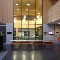
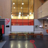
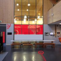
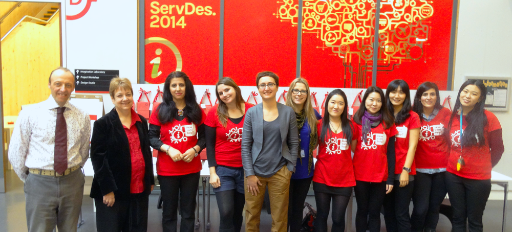
But back to design. My first big job was to create the right signs, décor and wayfinding for our Service Design conference. Our building has wonderful spaces — huge tall rooms clad with Scandinavian pine, and airy glass partitions. We’d not yet taken full advantage of these and I wanted to create something striking. So we took the existing branding and ran with it.
Do you know how difficult it is to find perforated hardboard in this day and age? Well, now you do. Thanks to Simon for putting the frame together and spray-painting it for us in time!
And if anyone wants shop display pegs for their garage, I still have a box of 100 under my desk.
PNG Digital did the printing and put the display up, displaying (hoho!) no end of patience to get the result we wanted! That’s all cut vinyl on the windows and cut paper adhesive on the walls. The detail these guys put into the job was nothing short of amazing.
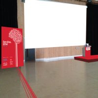
In the end the only thing that didn’t work out was the idea of having guiding lines on the floor. The electrical tape we thought would do the job was too see-through on concrete, and didn’t give the solid colour we needed to complete the look. But everything turned out alright on the night:
Corinne Pritchard
Latest posts by Corinne Pritchard (see all)
- Linked — 5 September 2016
- Designing a fashion website — 26 October 2014
- Service design conference — 9 October 2014
