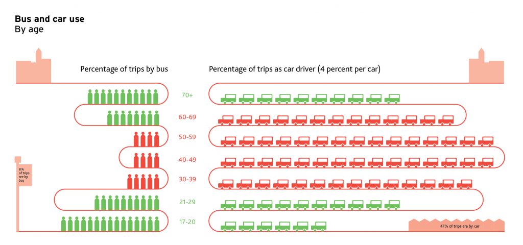
Here are two infographics I did for a report into ‘Why getting transport right matters to young people’ by the Campaign for Better Transport.
The first highlights the discrepencies in the number of local authorities offering cheaper bus fares to disadvantaged groups: people who are young and unemployed, compared with people who are disabled and older people.
The second diagram looks at bus use versus car use, and highlights the similarities between bus use in the young and the old, and the massive increase in car use (and decline in bus use) in mid-thirties and middle age.
The following two tabs change content below.


Corinne Pritchard
Information Designer at Simply Understand
I believe design and designers can and should make the world a better place. I love designing things that help people understand complex ideas.
Latest posts by Corinne Pritchard (see all)
- Linked — 5 September 2016
- Designing a fashion website — 26 October 2014
- Service design conference — 9 October 2014

